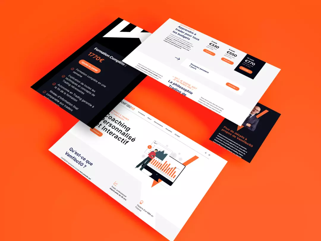
VAMFIBO50's Rise: Trading and Branding in Harmony
Client
Vamfibo50
Country
 France
Year
2023
About the project
VAMFIBO50 is a France-based online trading platform, offering a comprehensive suite of trading tools and resources for both novice and experienced traders.
Challenges & goals
The most significant challenge was instilling a sense of trust in users, given the sensitive nature of the online trading sector. Alongside this, the goals included a complete revamp of the website's UI/UX, improvements in on-page SEO, establishing a distinct brand identity, and ensuring seamless web development.
Testimonial
Challenges & goals
The most significant challenge was instilling a sense of trust in users, given the sensitive nature of the online trading sector. Alongside this, the goals included a complete revamp of the website's UI/UX, improvements in on-page SEO, establishing a distinct brand identity, and ensuring seamless web development.
Our solution
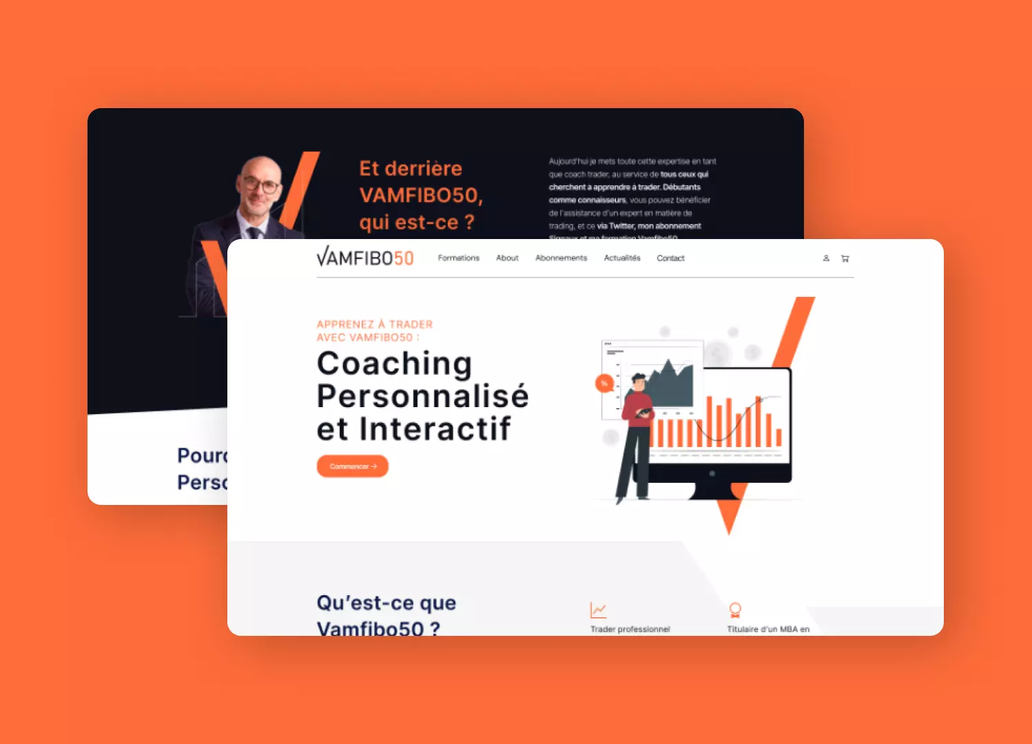
UI/UX Design
Focused on creating an intuitive and transparent user interface and experience to establish credibility and trust.
Brand Identity
Worked to create a unique and trustworthy brand identity to stand out in a highly competitive and often skeptical market.
Web Development
Ensured smooth deployment of all new website elements, balancing aesthetic appeal and functional efficiency.
On-Page SEO Optimisation
Improved on-page elements, targeting meta tags, headlines, and keywords to elevate search engine rankings.
SEO Copywriting
Developed quality, SEO-friendly content aimed at building trust while also satisfying search engine algorithms.
Netlinking Strategy
Implemented a robust backlinking plan to further solidify online credibility and improve search engine visibility.

Impact & results
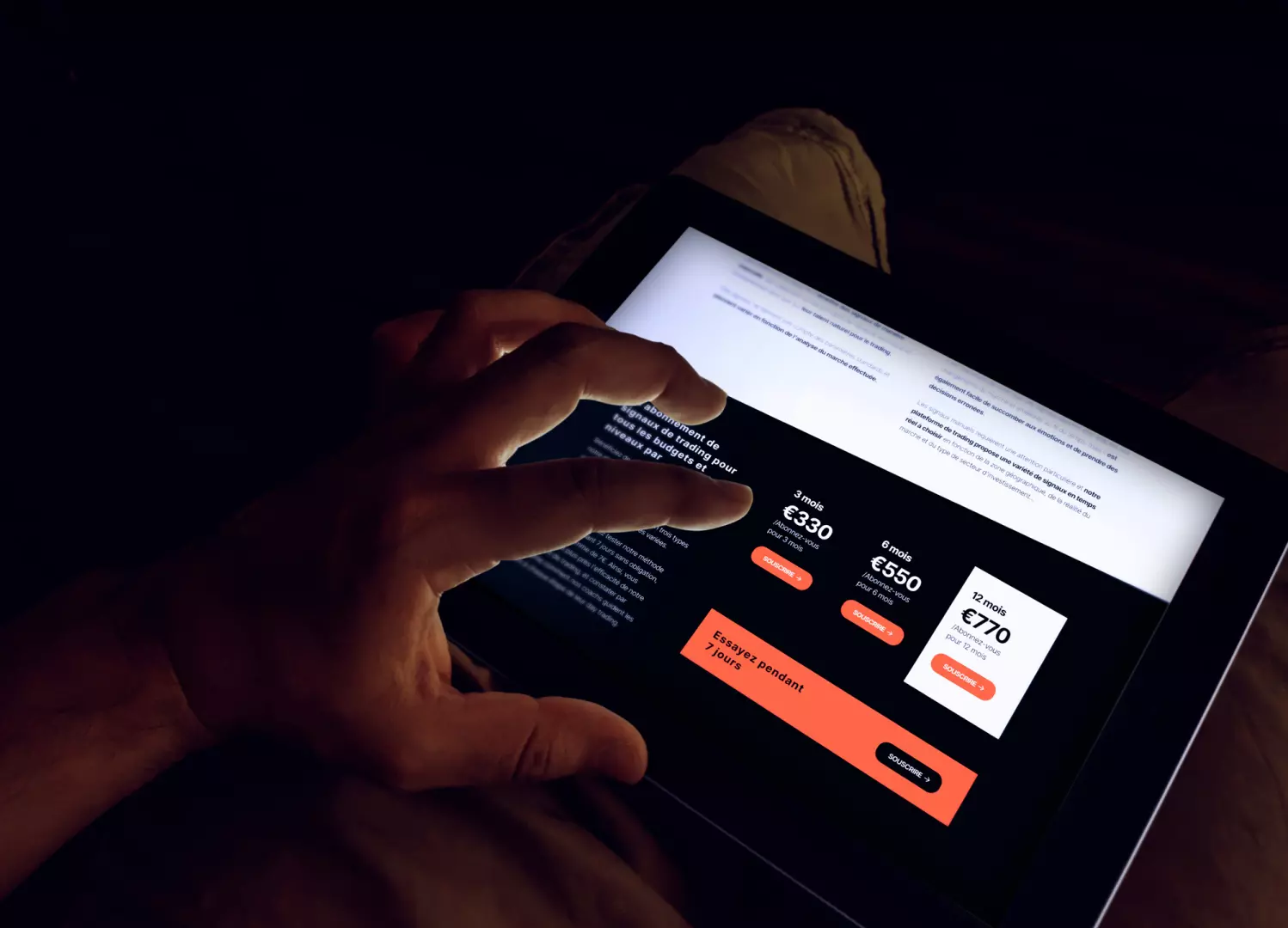
Our multi-faceted approach succeeded in creating a user-friendly, trustworthy platform with improved search engine visibility and a strengthened brand identity.
Creative direction
Vamfibo50's project started with a brand redesign built to feel clean, professional and genuinely powerful, using a semantic device to sum up the whole concept in a single mark rather than spelling it out literally. From that foundation, the identity got reinforced across every element of the site, not applied once and left alone, but carried into each section deliberately. The goal was to make the platform feel personal without giving up ease of use, so every touchpoint reads as considered rather than generic. That balance between personality and usability is what carries the identity through the whole experience.