Spares in Motion – Brand Strategy & Identity Refresh
Client
Spares in Motion
Country
Netherlands
Year
2025
About the project
Spares in Motion is a global wind energy supplier focused on spare parts, procurement, and refurbishment. The company approached us to modernise its brand while maintaining the trust and recognition built over a decade in the sector.
Challenges & goals
Testimonial
Challenges & goals
The brand needed to evolve—visually and strategically—without losing its identity. The goal was to align the messaging with new services, highlight the company's leadership in sustainability, and deliver a full set of brand tools usable across departments and platforms.
Our solution
Brand Strategy
We developed a modular messaging framework adaptable to various audiences—technical, operational, and strategic. Slogans and taglines were reworked to reflect the company’s human approach and sustainable mission.
Brand Book
We produced a comprehensive Brand Book covering mission, values, tone of voice, messaging, and visual guidelines. It ensures consistent communication internally and externally.
Brand Identity
The existing logo was modernised for better clarity and scalability. We defined a visual system—palette, layout rules, and font pairings—that supports both digital and print formats while reinforcing brand coherence.
Business Assets
We created presentation templates, business cards, social media assets (covers and editable templates) and branded email signatures—ready to use and easy to update by the internal team.
Impact & results
Spares in Motion now has a refreshed identity that reflects its position as a global player in circular energy solutions. The updated brand is future-proof, cohesive, and aligned with the company’s mission to support smarter, more sustainable operations across the wind sector.
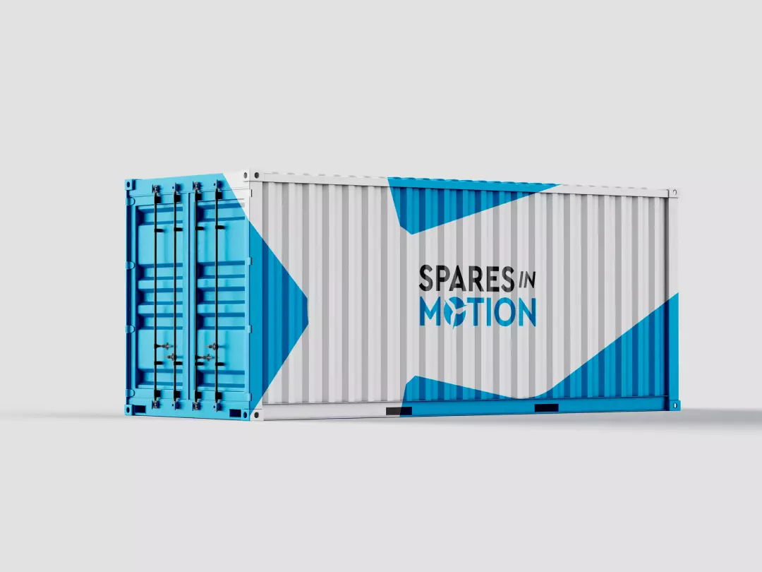
Creative direction
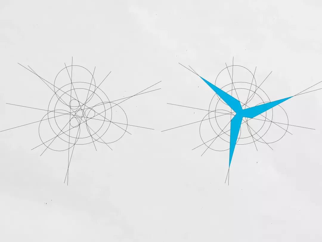
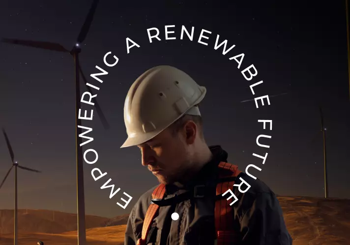
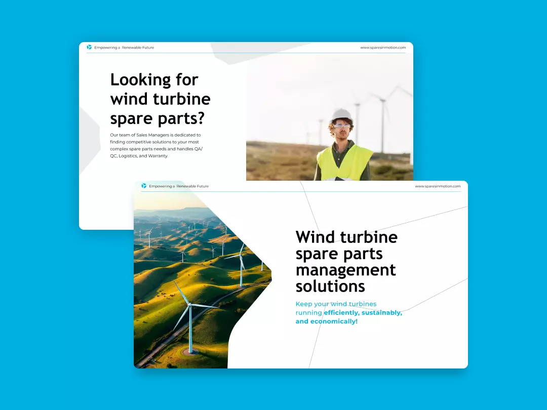
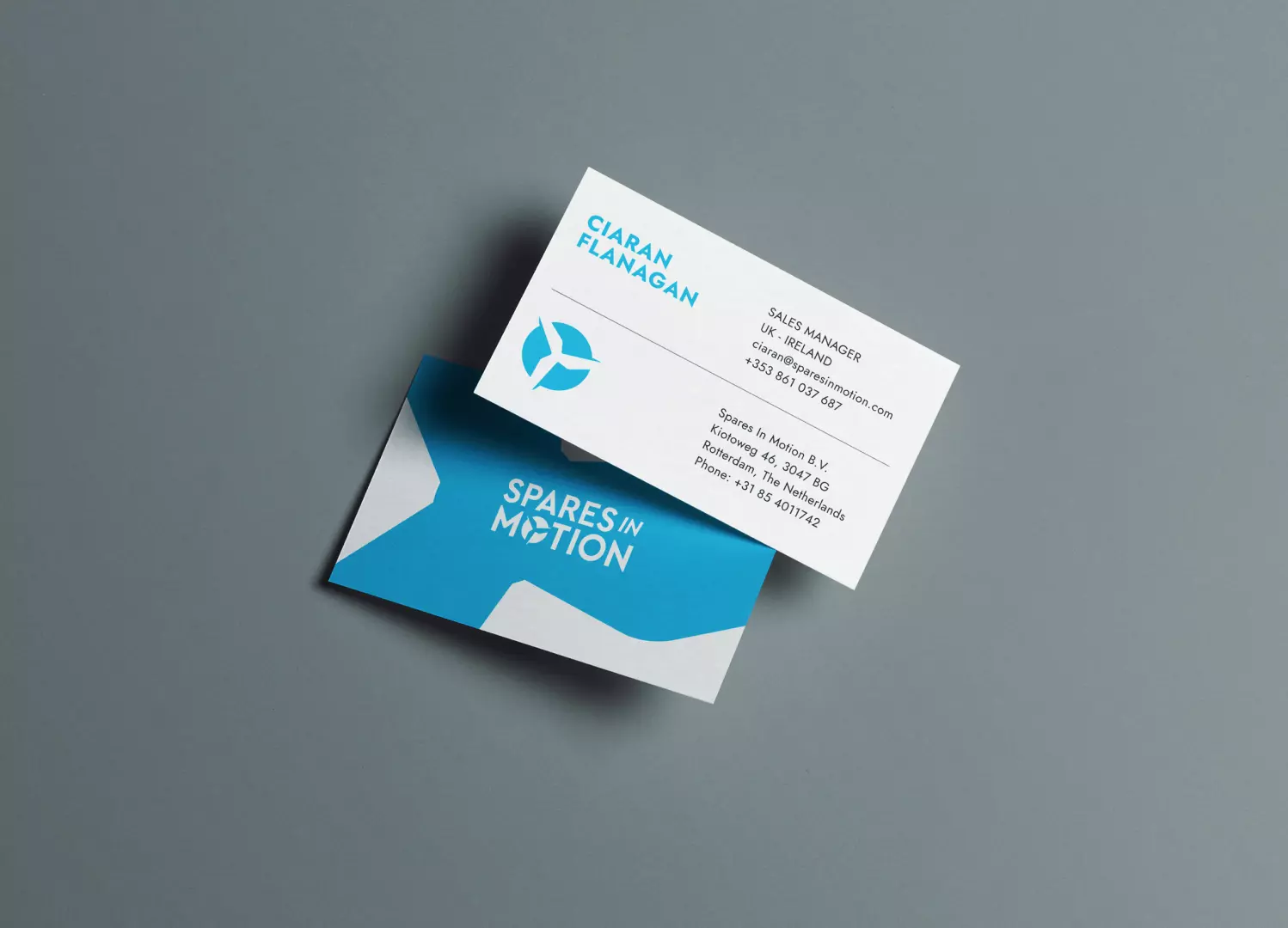
The redesigned identity for Spares in Motion effectively blends precision, sustainability, and motion—three core elements of its brand. The new logo refines the original by introducing a simplified turbine symbol that communicates movement and clean energy, while the geometric construction behind it highlights engineering accuracy. The typographic system smartly contrasts bold and light weights to emphasize reliability (“SPARES”) and dynamism (“IN MOTION”), supported by a vibrant electric blue that conveys energy and trust. Together, these choices create a clean, modern, and technically sound visual expression aligned with the renewable energy sector. The visual system extends seamlessly across applications—from business cards to fleet livery—employing sharp angles, modular layouts, and strategic color blocking to convey momentum and clarity. Whether applied to digital platforms or physical assets, the identity remains scalable and instantly recognizable. Human imagery and environmental context further ground the brand in its mission to empower a renewable future, striking a balance between professional dependability and purpose-driven innovation.